Plus Forward logo design
I basically tried simplifying the logo a bit more since it seemed too "busy". But i have no professional opinion due to not being a professional. ;)
If you happen to be a skilled logo designer feel free to come up with a completely different logo that's actually well designed, would be very appreciated. :D
In the meantime please help me decide.
If you happen to be a skilled logo designer feel free to come up with a completely different logo that's actually well designed, would be very appreciated. :D
In the meantime please help me decide.
Design 1 (Original): Design 4:  Design 7: 
|
Design 2: Design 5: 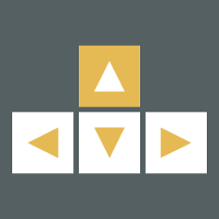
|
Design 3: Design 6: 
|
All in all looks really nice.
but even w/o it it looks nicej
e: or actually proportion is rather same, just +f key is not hollow as others
So you mean like this?
I only mentioned 3rd to explain what i liked about 2nd -___
maybe with reversed coloring (outer white square on +f) as on original 2nd option ))) probably cause i dont see this orangy color matching background color too well and liked to see less of him, oh well
its gold ffs :P
if anything its a yellowy color!
2. I like how the inner square is filled orange rather than just reversed coloring, makes it look more like its pressed down but it does make it look less interesting than the other three keys.
3. This one is nice and simple and has the symmetry of 1#.
4. So this one is kinda the other end of the scale compared to 1#, yes clean and simple, easy to read but they keys can be mistaken for something else than key (building blocks mb ?).
5. The arrows makes the logo represent directional keys specifically while it still maintain a simple design.
6. Strong emphasis on that its FORWARD!!!! but the arrows on the forward key breaks the shape of the other three keys.
7. So this one is a piece of art rather than a logo. The keys doesn't look like keys and there is no sens of direction. It does put emphasis on the forward key though since the coloring is reversed but it doesn't really help much since it fails in the other regards.
7#<4#<1#<2#<6#<3#<5#
Btw, in the logo you are currently using in the top left corner, are there black edges around the triangles (sort of like on some of the crosshairs in QL) or is it just an effect of the minimized size ?